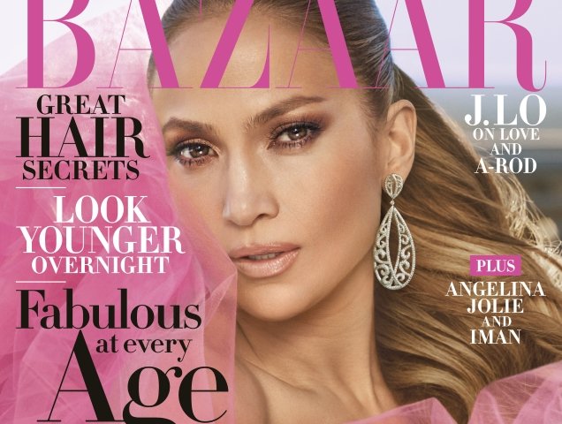
We love when someone unexpected appears on the cover of our favorite fashion glossies and, despite what you may think, Jennifer Lopez can be a rare sight at the newsstand. J.Lo’s last notable solo cover was for W Magazine back in 2016, but Harper’s Bazaar just made her its cover girl for April 2018. Shot by Mariano Vivanco, Jennifer was photoshopped photographed on location on a rooftop in downtown Los Angeles at sunset, wearing a vivid pink Oscar de la Renta gown and sporting a soft and sultry makeup look in the newsstand cover image (below).

But something seems seriously off, according to our forum members. “Jennifer Lopez and US Bazaar should be a great match. But what’s with the odd cover shot — this less-than-glamorous neck twist? Did they try to capture her mid-movement?” questioned tigerrouge the moment the cover struck.
“I instantly liked this! Yet on closer inspection, Jennifer’s mouth area looks really off in the shot, as does the jawline and cheek area. They’ve clearly gone OTT post-production (again),” vogue28 noted.
[ Not a tFS forum member yet? Click here to join! ]
“What in fresh hell? How can you ruin someone this photogenic! This is so cropped up, and it feels like it’s an image manipulated and taken out of context, she is obviously mid-movement,” pointed out Miss Dalloway.
Simera felt the same way, adding, “Her face looks super weird, like they Photoshopped a face from a different photo with a different angle onto this photo!”
MON was also quick to air some concerns: “It looks so smooth, in the most respectful yet terrible way. The face looks superimposed. The background looks fake. Too much pink!”
“This is all wrong and Jennifer Lopez is so photogenic! Too much with Photoshop. Plus one of her best features is her smile. I think if she was smiling the cover would look better, but ALL of Harper’s Bazaar‘s cover are the worst,” slated RanThe.
“Yeah not really feeling this cover,” confessed TeeVanity.

See more from Jennifer’s cover shoot and share your thoughts here.


