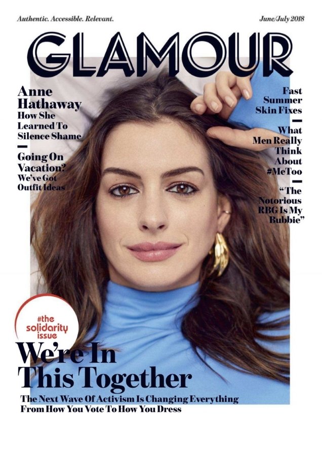
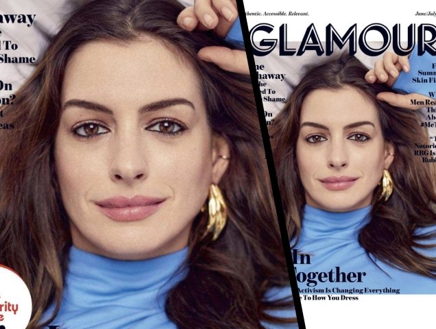
‘s first cover as editor-in-chief of Glamour featuring Melissa McCarthy was an epic fail according to our forum members and the unfortunate new redesign is sticking around for the magazine’s double June/July 2018 edition. Glamour’s latest victim cover girl is actress Anne Hathaway, whose last notable appearance on a mainstream fashion glossy was for ELLE back in April 2017. The actress and Ocean’s 8 star serves up a perfectly fine portrait, photographed by Billy Kidd.

It’s a shame the atrocious art direction ruins it and our forum members weren’t afraid to call the magazine out. “Glamour? Hah! What a joke!” mocked GivenchyHomme.
“They have got to regret this redesign,” added Jal718.
“Somehow they managed to make the new redesign even worse than the previous cover that had the ridiculous text font,” noted SLFC.
[ Not a tFS forum member yet? Click here to join! ]
Also not warming to the magazine’s new look was MON. “I seriously detest this new art direction. I don’t see this lasting very long. Imagine spending money for this mess that won’t even last a year? It’s so crowded. So does this mean that all Glamour covers will simply be headshots? Whoever thought that this layout deserves to see the light of day needs some serious soul-searching,” he wrote.
“I don’t like the redesign at all!” agreed forum member RanThe. “Anne looks okay. I mean she usually looks the same in all photoshoots anyway!”
“It’s actually a really nice cover shot,” 333101 confessed. “It’s just all absolutely ruined by the cover design. It doesn’t even look worthy of a mock-up! And I can’t say I’m impressed by the styling from the editorial. Sick of the sight of those trainers!”
Benn98 wasn’t fond of the styling either. “Stylists complain about Gucci fatigue, but what about LV? It’s becoming increasingly challenging to make their designs look remotely interesting. That said, Anne looks really comfortable in these looks,” he reasoned.
Wish Glamour never introduced this redesign? Vent out and join the debate here.


