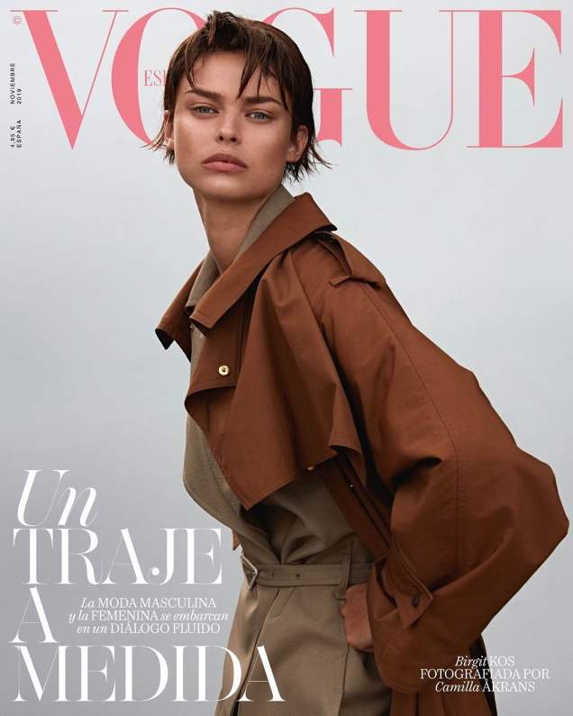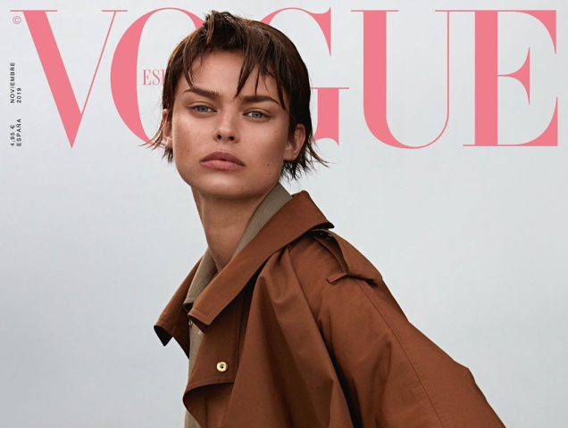
“I like it, very simple. Is it just me or does she look like Linda Evangelista?” asked jorgepalomo.
“Yeah I agree, that’s the first thing I noticed,” replied FashionMuseDior.
“I agree about Linda Evangelista, it was one of the first things I thought of! I love Birgit and I think this is a great minimalist cover,” applauded Mercury6181.
[ Not a tFS forum member yet? Click here to join! ]
“The cover is minimalism done right. No fuss, just simple, to-the-point fashion. Sometimes that’s all some of us need. Not 24/7 Luigi & Iango theatrics,” Benn98 pointed out.
“I do like what I’m seeing here, can appreciate the Linda Evangelista vibes with the short hair on Birgit, the pose, the composition and the overall simplicity of the cover. Less is always more!” declared vogue28.
Srdjan felt the same way: “Loving it! I generally prefer Birgit looking glamorous and feminine, but this is such a great transformation. The combination of colors is so soothing.”
Although not everyone was a fan. “Would have been a nice shot if it had a background, maybe on some city street with red brick buildings or something. Something is weird with her eyes, but nonetheless it’s passable. Could have been so much more, though,” critiqued SLFC.
“This would have worked wonderfully as an outdoor shot and a little bit of autumn sun,” dodencebt chimed in.
Are you a fan? Check out Birgit’s cover shoot and share your thoughts here.


