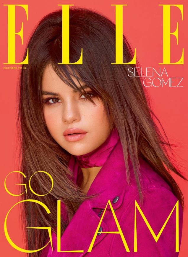
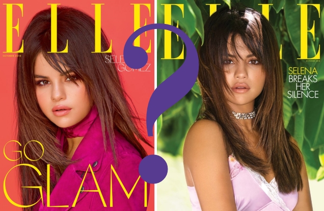
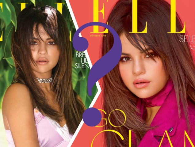
Our forums are not typically fans of the global cover shoot deals ELLE and Harper’s Bazaar rely on from time to time — because someone always ends up with a better cover. Twelve months ago, ELLE gave us an overdose of Rihanna and British ELLE‘s cover came out on top. Now, the magazine is back at it with Selena Gomez for October 2018, who is set for global newsstand domination, photographed by Mariano Vivanco and styled by Anna Trevelyan. In stark contrast to the American cover‘s outdoor shoot, Selena is shot against a bright studio backdrop wearing a fuchsia biker jacket from Coach (natch) while prompting us to ‘GO GLAM.’

Who won the cover battle this time around? “That will certainly stand out on the newsstand, ” remarked tigerrouge straight away. “I feel it’s been so long since I’ve seen a UK magazine choosing to look so bold, that I don’t have anything else to say, other than I want to see how well this works in the store.”
“We definitely got the better end of the deal with this cover story compared to the US! I actually like the cover here with the red background,” said 333101.
“I actually really like this cover. The layout isn’t very good but I like everything else,” confessed SLFC.
[ Not a tFS forum member yet? Click here to join! ]
But not everyone was 100% here for the magazine’s choice. “Colors are perfect and striking, but I really cannot get past the hair. And the entire cover looks like those old romanticized paintings of children,” mocked Benn98.
“Yikes. I hate we’ve got her on the UK cover too as well as the US. For me this is just awful, her face looks so bizarre and unlike what it actually does in real life due to some odd Photoshopping,” said honeycombchild.
“That hair should have been left in 2002, where it belongs,” MON ranted.
“Her hair looks weird. It looks like a misplaced wig,” laughed Perickles.

Which cover do you prefer — if any? Join the conversation here.


