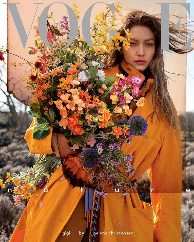
Joining the likes of Vogue Arabia, Vogue Hong Kong and Vogue Brazil, the newly established Czechoslovakian edition of Vogue jumps on the Hadid bandwagon with three Gigi Hadid covers for May 2019. Not just any old cover shoot, the magazine enlisted supermodel Helena Christensen to photograph Gigi outdoors at her family’s farm.

The all-important question is, were our forum members impressed? “Their strongest offering yet! I must say I love these, as random as they are,” Roayl-Galliano commented at once.
“I hate to say but it looks pretty damn good, probably the best covers Gigi has done,” echoed luchang732.
[ Not a tFS forum member yet? Click here to join! ]
“This must be Gigi’s best cover… I think it is one of the cases when the photographer really understands the model and sees where her strength lies. Also a very strong case for women photographers. They see women’s beauty the way men can’t,” KissMiss said.
In complete agreement was happycanadian: “I think these are friggin’ gorgeous. Helena did an amazing job and Gigi looks sensational. All of them, but particularly the first one, are just sublime.”
“I’m actually somewhat impressed. I only really like the first cover, even if it is kind of generic, I’m just a sucker for the beautiful flowers. The minimal text is nice as well,” Nomar appreciated.

Other forum members weren’t so impressed. “Gigi’s tiny head gets swallowed by all those flowers and the big orange coat,” pointed out mikel.
“The first cover is an absolute mess. The Vogue masthead got lost with all the flowers and the hair. The art direction is subpar. ‘Nature’ got lost and is a pain to read. It would have been better if it were just the word ‘nature’ written on the right side of the cover. The second cover is uneventful. The third cover. Utterly irrelevant,” slammed MON.
Benn98 agreed. “God, these are really terrible. It may have worked better for a campaign because the masthead and text are simply too much. Helena should stick to modeling. The design elements are way overdone and try-hard,” he commented.
Also calling out the layout was forum member apple: “I don’t understand the art direction of these covers. As single shots I like the pictures but considering the whole thing (masthead, font and all) they aren’t convincing.”

A hit or miss of a cover for Vogue Czechoslovakia? Sound off and await the contents of the issue here.


