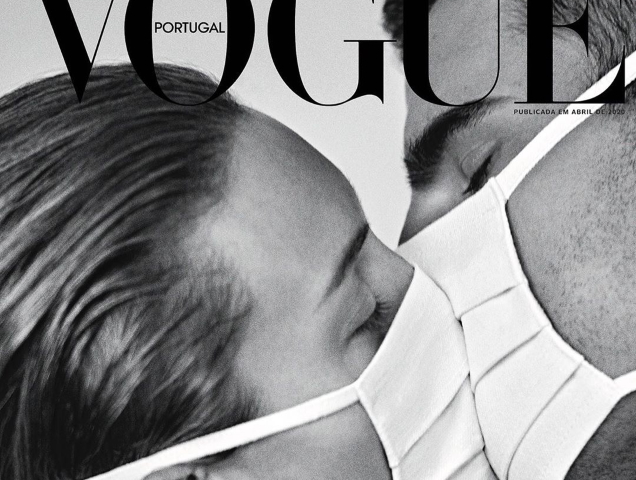
It was only a matter of time before our favorite fashion glossies began to highlight the ongoing pandemic. French ELLE recently thanked medical professionals for fighting the disease with an illustrated cover and now Vogue Portugal addresses the virus with the unveiling of two covers for April 2020. Cover one (below) features Bibiana Baltovicova and Adam Bardy kissing while wearing surgical masks captured by Branislav Simoncik. For the second cover (after the jump), strategic lighting was used to create the illusion that Lily Stewart is wearing a mask in the Renée Parkhurst-shot image.
The covers missed the mark for our forum members, however. “You can always count on Vogue Portugal when it comes to the most pretentious covers. Just stop with this ‘woke’ sh*t. Vogue is a fashion magazine. If I want to read about world issues I will watch the news. I understand that they wanted to make a statement, but why so literal? They have chosen the laziest option possible,” critiqued avonlea002.
“Not sure I want to be reminded of COVID-19 on the cover of a fashion magazine. It’s not like Vogue Portugal is even paying respect to those who it has taken or the medics who are fighting against it (a la ELLE France). Very…questionable,” vogue28 chimed in.
[ Not a tFS forum member yet? Click here to join! ]
“Extremely tasteless,” declared Srdjan.
Forum member pizzicato wasn’t impressed, either. “‘Brain on Hold’ would be more appropriate for this. By March 30, 2020, the virus had infected over 730,000 people worldwide and the number of deaths totaled more than 34,000.”
“It’s tacky. Trying to make money off the pandemic is tacky and tasteless and one of the ultimate things anyone in marketing or PR should NOT be doing right now. The first cover could possibly have passed as commentary, like Franca Sozzani’s Vogue Italia, but their decision to actually use COVID-19 as a cover line ruined it all,” commented Benn98.
“I think the first cover is a really pretty one, it caught my attention right away. As literal as it is, I think it’s a beautiful image,” defended slayage.
“That’s how you make a statement. The first cover is stunning,” admired MON.
How do you feel? Join the debate here.